Sunday, October 30, 2016

Visual Dynamics: Week 6, Unity and Balance

Office Light Render

This week we completed our office renders by adding light to the scene. To create the lighting in this scene I used the multiply filter, overlay filter, dodge and burn tools, and Gaussian blurs.

Before:


After:


Panoramic Project

My panorama (Click for larger view)


This week we studied unity and balance and our assignment was to create a panorama using a camera and Photoshop that incorporates symmetric balance.

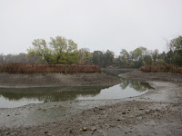
In order to create my panorama, I took 13 pictures in total. I found this location on the Chapman Mills walking trail. The water level is very low, exposing the river floor and allowing me to take this awesome panorama.

Source images below (downsized): 


After putting them together in photoshop using the automate > photomerge feature, using the adaptive wide lens tool to correct distortion and then cropping, I created this panorama:


I took the pictures on a rainy day so the colors looked somewhat dreary, but I used various filters, effects, and masks to make the image pop more. I used replace color to make the red of the cattails and the green of the trees more saturated, then used a vibrance filter and increased the vibrancy of the entire image. I also made the image brighter and raised the contrast of the ground so that it had more texture and was more of yellowy brown color. I then used sharpen to bring out more details in the ground and on the island, and then used a slight blur on objects that were farther away.

Finally!

Elements of Rhythm:

Flowing Rhythm: Island, Water, Wet Ground, Ground, Outer foliage.


The island, water, wet ground, ground, and outer foliage create a flowing rhythm because they make curved shapes that are repeated and create a sense of movement. They cause your eye to first look at the island, but be pushed outwards away from the island. This kind of flowing rhythm where your eye is pushed outwards away from an 'island' reminded me a lot of Japanese rock gardens:


(Image from http://www.newsjardintv.com/histoires-des-jardins/JARDINS-JAPONAIS-LE-DESIGN-DU-NATUREL.html)


Repetitive Rhythm: Cattails and Weeds


The cattails and weeds in this panorama are the best example of repetitive rhythm, because the cattails and weeds occur regularly, with little variation. For the most part, their vertical stems create an easy pattern to anticipate.

I think that the combination of symmetric balance, flowing rhythm and repetitive rhythm caused cattails, the scene has a 'xen' and 'perfect' look to it.

Random Rhythm: Shoreline of pebbles


Another example of rhythm in this photo is random rhythm, where the best example of this is the rocky shoreline.

Asymmetric Image and Ad

I then cropped the image to create the asymmetric version seen below. I decided to use this version of the image to make a pro-Ontario wildlife/ecosystem ad because I thought that it matched the photo. 

The Ad:


Honorable mentions

These are other panoramas I created at the Chapman mills trail and Strandherd bridge.

Wooden deck Worm's eye:


Choose your destiny:


Awesome river scene:


Feeling 'under the bridge'!:


Monday, October 17, 2016

Visual Dynamics: Week 5, Rhythm and Proportion

Heavy/ Tough Character - Viking

This week, we explored proportion, and explored how it can be used to convey information about a character. For example, how the "Heavy" pugnacious character has a small cranium, large chin/jaw, large chest, and narrow waist (as well as other proportion details). These proportions can be used to make a character look tough or intimidating.

The "Heavy" pugnacious character, by Preston Blair:


To further explore the proportions of the tough character, we designed our own characters to these proportions. I chose to design a viking character.

Below: First sketch (left) and revised sketch (right). I made sure to make the viking have a small cranium but a large jaw. In the first sketch, the helmet made his head look not as small as I wished, so in the second sketch I decided to make a pointed helmet instead. I also made the viking have eyes that were small and close together, small ears, a large lower lip, large chests, long, heavy arms, huge hands, a small torso, thin legs, and large feet.


Below: The sketch with the proportions guide overlayed on top.

Caricature - Mr. Bean

We also created caricatures, in which we used Adobe Photoshop to exaggerate their most striking characteristics of famous people. I chose to do my caricature on Mr.Bean, using two images as source material.

Below: Source material images.


Since Mr.Bean is a goofy character known for his funny facial expressions, I wanted to use proportion to show his goofiness while exaggerating the facial expression shown in the left source image. I decided to try using Preston Blair's "Screwball" proportion.

Below: The "Screwball" type, by Preston Blair.
Image result for preston blair screwball

Below: Proportions of Mr. Bean caricature. I gave Mr.Bean a low forehead, elongated head, skinny neck, and pear shaped body to look like a goofy character.. I also exaggerated his facial features by giving him more wrinkles, arcing his eyebrows more, making him smile more, and increasing the size of his eyes, nose, ears, and mouth.


Monday, October 3, 2016

Visual Dynamics: Week 3, Value and Color

During week 3, we continued with our animated dogs. We explored two different techniques to color in the dogs to achieve a 3D look similar to in Pixar movies.

Using gradients:
Using light renders:

We also set up our own photo shoots where we controlled the lighting to produce the effects we want. Since I chose glass objects for my photo shoot's object, I had to do a bit of research online on how to take good photos of glass. I found this tutorial online and it was perfect!
https://www.youtube.com/watch?v=BlQwt7_ZXKg 
I didn't need everything from the tutorial, however, it did teach me some cool glass techniques and concepts. For example, it taught me a technique of using two glasses one on top of the other for a reflection effect, and also that if you shine a light on one side of the glass, the refraction will cause that color of light to appear on the opposite side of the glass.

Here is my photo shoot set up:


And here is the result:

After some touching up:
'Pirate Magic'


Last of all, we explored ways to edit, modify, and colorize our photos in PhotoShop. I am proud of how my images turned out:

'Morning Lighting':

'Night Lighting':

'Painted' (Recolorized):

Cool Foreground, Warm Background:

Complementary Colors:

ALL PHOTOS COPYRIGHTED BY KATIE VAN

Monday, September 26, 2016

Visual Dynamics: Week 2, Shape

During week 2, we explored letters as shapes. Below, I experiment with the letter A to make an Eiffel tower as well as some other shapes:


I also explored different fonts and how I could adjust them to carry meaning. I used a wide font and used a warp effect to make it look like it's bulging for 'weight gain':


I used a star-speckled font and changed the perspective on it so that it would lead your eyes vertically upwards, trying to suggest excellence, spirituality, ascension, aspiration, etc. as in the 'etoile du nord' photo below:

excellence, spirituality, ascension, aspiration, etc.


I also created a typographic logo for the James Bond Gold Finger movie. To do so, I used a strong font similar to the one one already used in the gold finger movies to make it seem more iconic. I saw that the L is shaped similarly to a gun, which is another iconic symbol of James bond, and combined it with the idea of a finger gun. (Someone pointing the index/index+middle finger while raising their thumb to look like a gun). The D serves as the trigger of the gun. To tie it up, I made the the letters of the word 'GOLD' a gold color, which simultaneously also helps to highlight the gun shape from the hand. The bottom part of the hand could also be perceived as another gun.


Using Photoshop, I built the body of a dog using round shape paths: