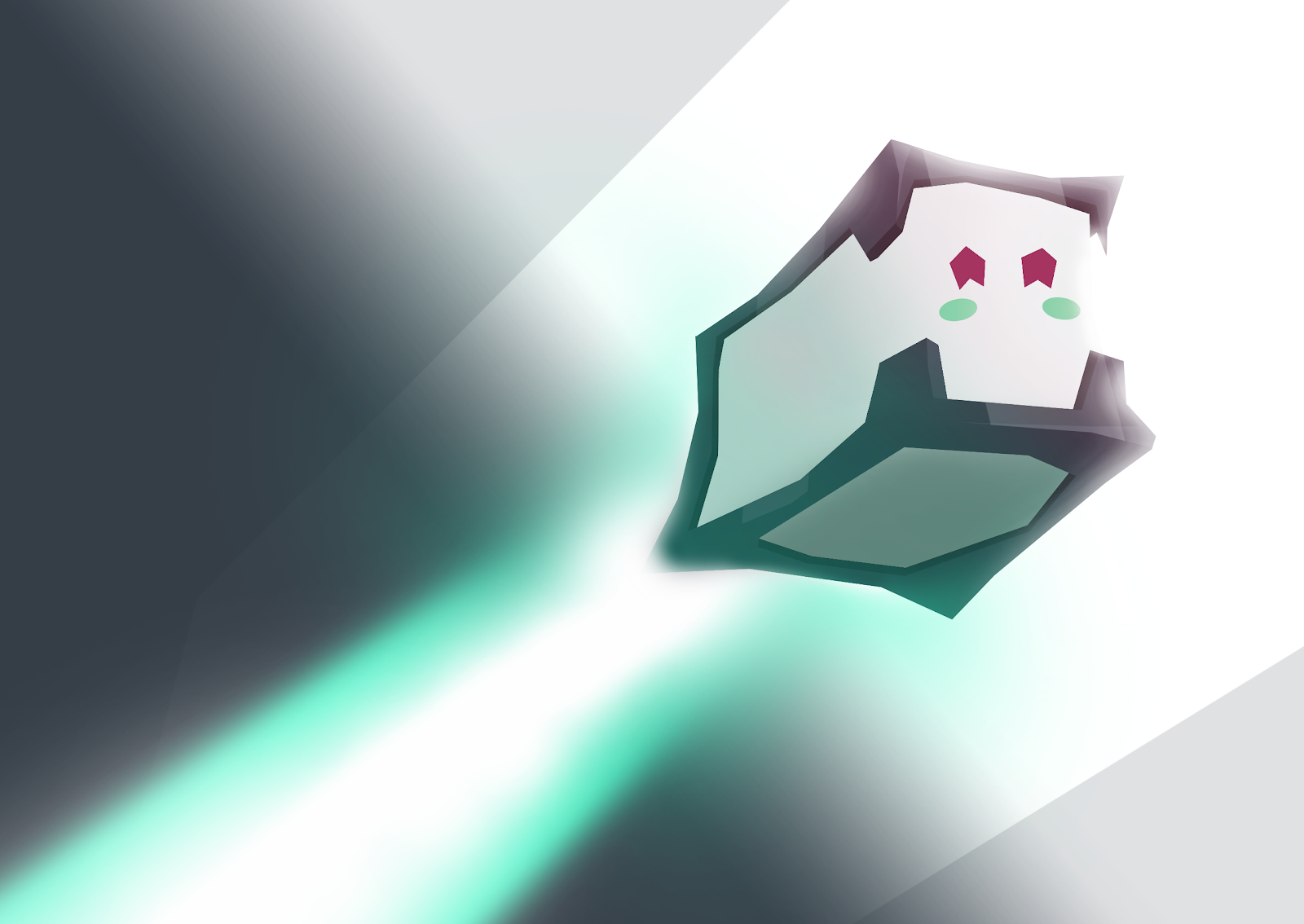
MASCOT:
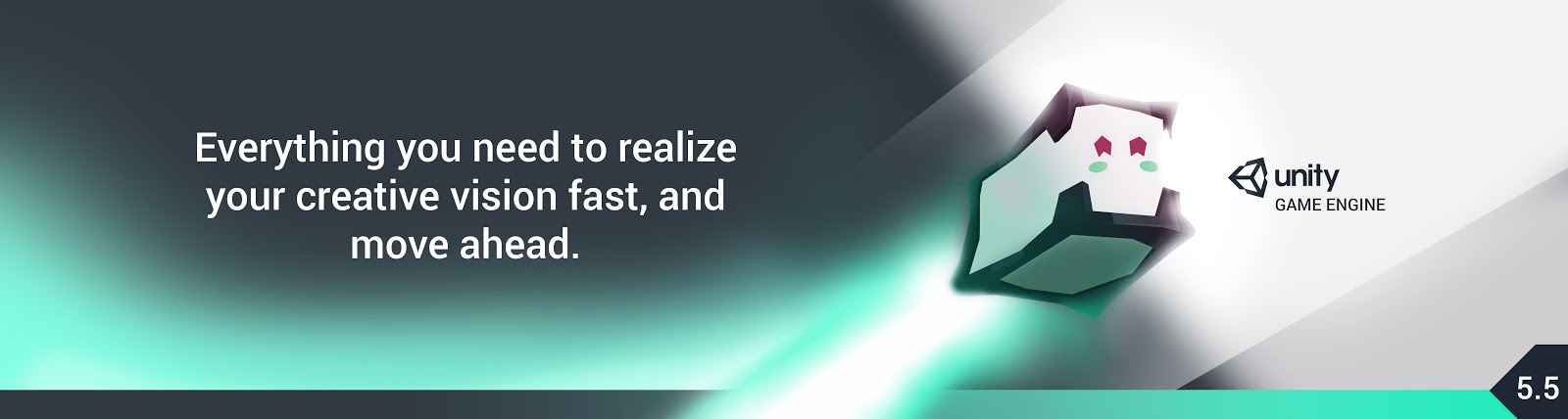
UNITY SCREEN/WEB AD:
UNITY VIDEO AD (STORYBOARD):
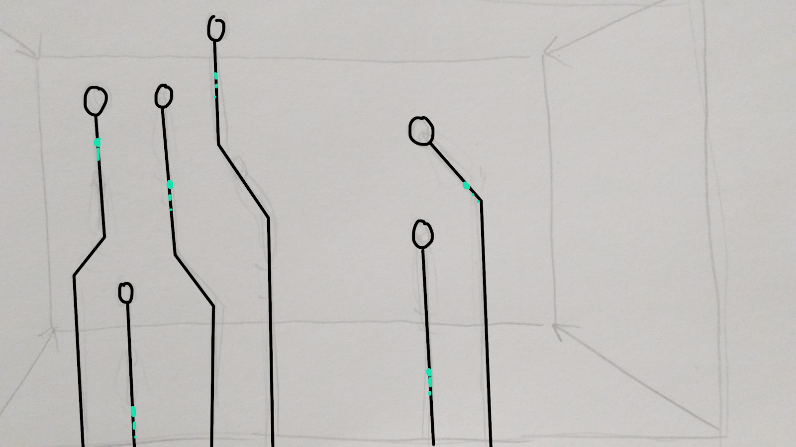
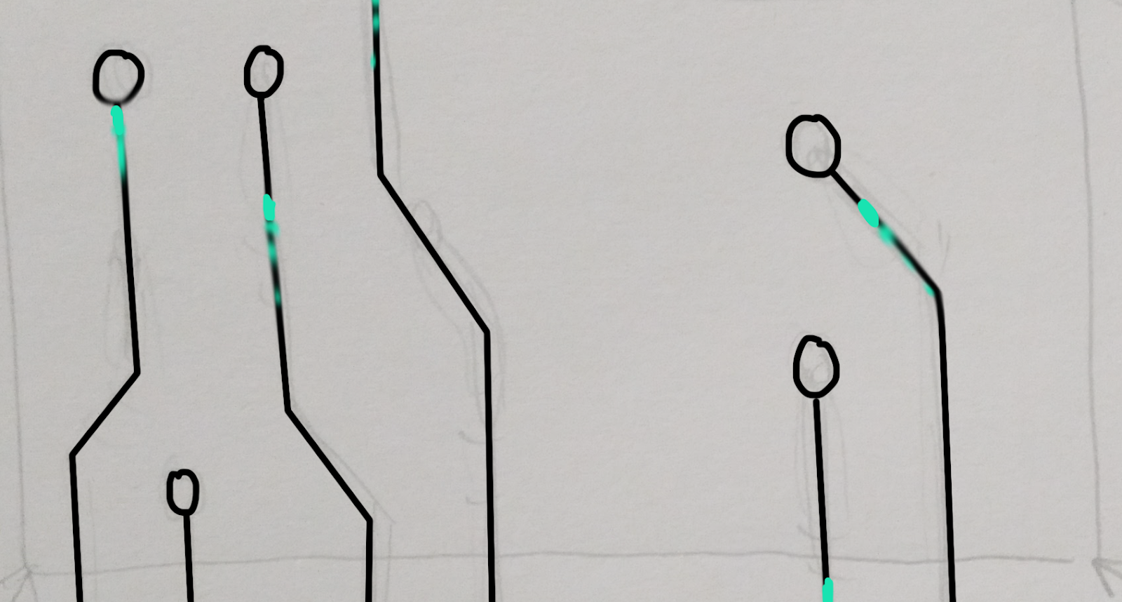
A structure reminiscent of a part of a compute. The camera zooms in, and streaks of blue light appear to travel up towards the circles.
As the camera gets closer and starts to tilt forward, it is now visible that the structures appear to be some sort of road that our character, Uni, is racing down.
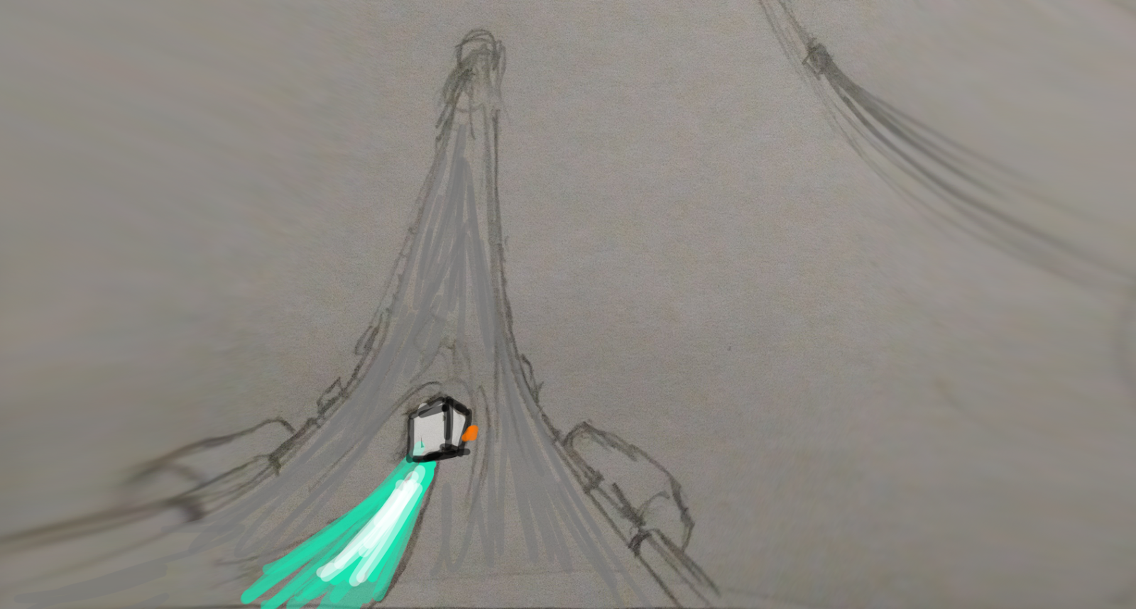

The camera shows a closer side view of our main character Uni
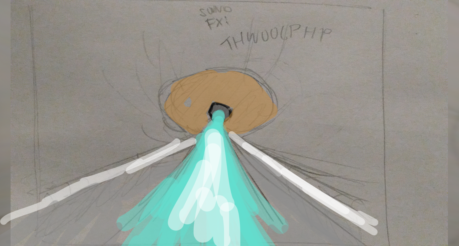
Uni enters the round circular structure, which looks like a teleportal.
 Uni pops out of the portal, almost crashing into the camera. The block of data it was holding starts to disintegrate
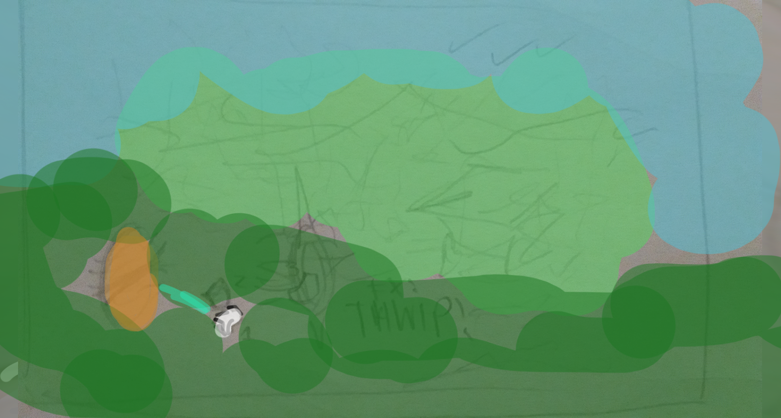 Uni flies out of the portal. The camera is far out to show the new environment: a spectacular game world.
Uni Flies back through the portal.
A far out camera shot view watches a blue streak go down a similar “road” into a portal

Uni appears in yet another world. Some humor is added by making the portal point directly into the ground. Uni looks around.

The camera stays in a low shot pivoting around Uni as Uni looks around.
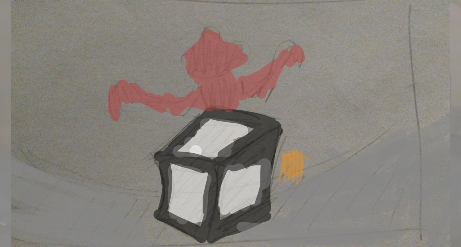
Until Uni sees a “Bad guy” from the video game and exits through the other portal.
This time, Uni is teleported to a world where he’s wearing a VR headset.
The game is revealed to be a very meta game. It is phone game inside of a computer game inside of a xbox game inside of a VR game etc. The camera ‘flips’ through the different metagames inside of the games faster and faster while fading to white.
While it is fading to white, there is text as well as a voice narrating. Meanwhile, the back of Uni is fading gradually into the unity logo.


RATIONALE:
Target Audience:
- Ages: 15-50
- Game Developers
- A large percentage of unity game developers may not know how to code necessarily; many of them are designers or artists.
- Higher percentage of male audience
- People who are interested in games and making games
- Many people who are interested in making a game already have ideas that they wish they could turn into a game
- The people who want to make games in Unity are generally pretty creative people. (designers, artists, programmers, game designers, etc)
Design Choices:
Before jumping into design, I first researched to get a better idea of unity’s pre-existing branding, what types of colors they used, what types of shapes and styles they often use, etc. I also looked at mascots for game engines or technology companies and thought about what I could learn and implement from those. In total, I have quite a bit of research which is at the bottom of this blog post.
I wanted to create a mascot that looked similar to Unity’s logo, so it would easily be seen as belonging to unity. In this case, I decided to start simple by creating a cube shaped character.
At first I listed some traits that I wanted my mascot to imply to appeal to game developers:
Stability, logic, techy, friendly/cute
And then with some inspiration of a dream I once had, I created this character: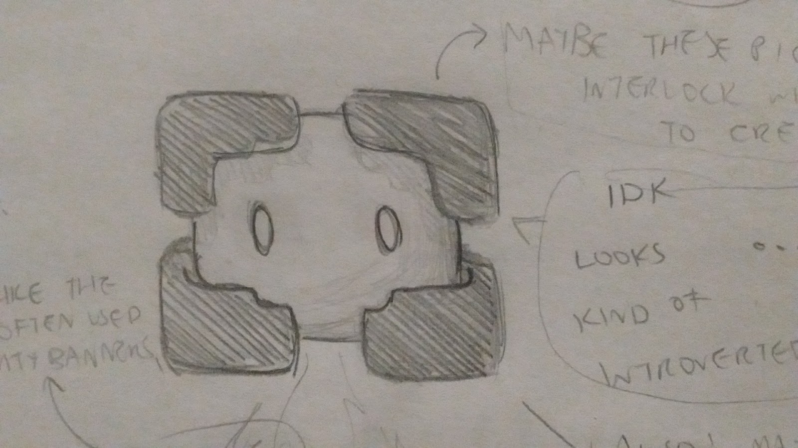
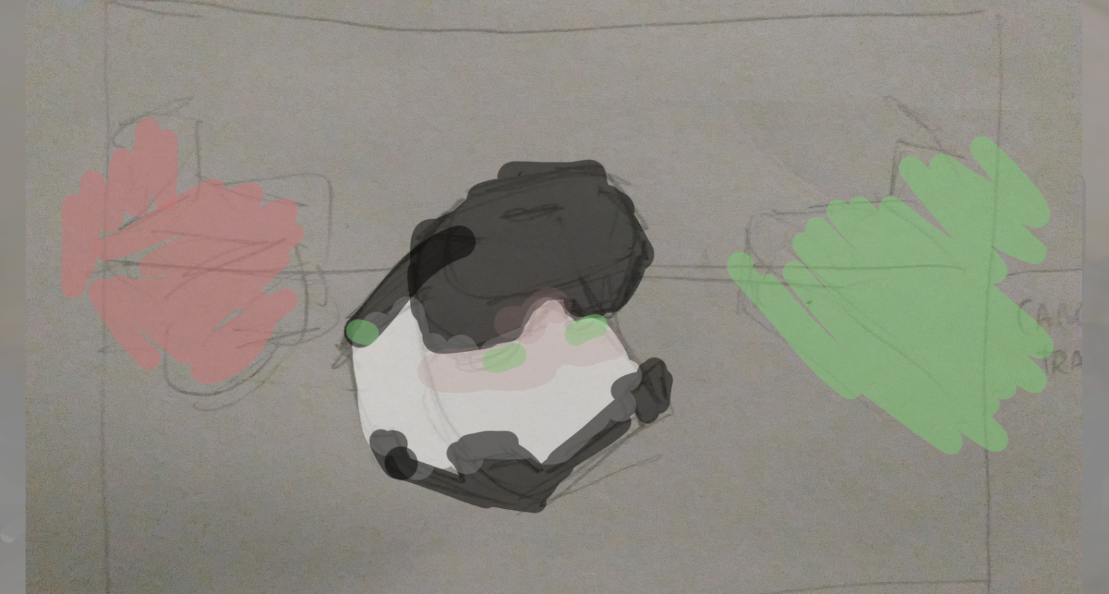
Since I wanted the character to appear friendly, I used lots of rounded corners. However, the rounded corners combined with how the character seems encased by it’s black L shapes made it appear introverted and too cute, rather than logical and techy. It did not have the overall feel of Unity.
(At this point I named the mascot ‘Uni”)
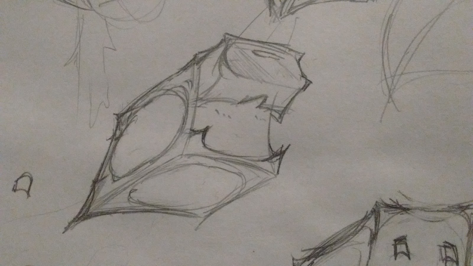
I created several more versions of Uni, and although they were less rounded than the first, they appeared to have the same types of problems. I also tried going for more dynamic poses/camera angles since a square is quite immobile and I wanted it to seem as dynamic as possible.
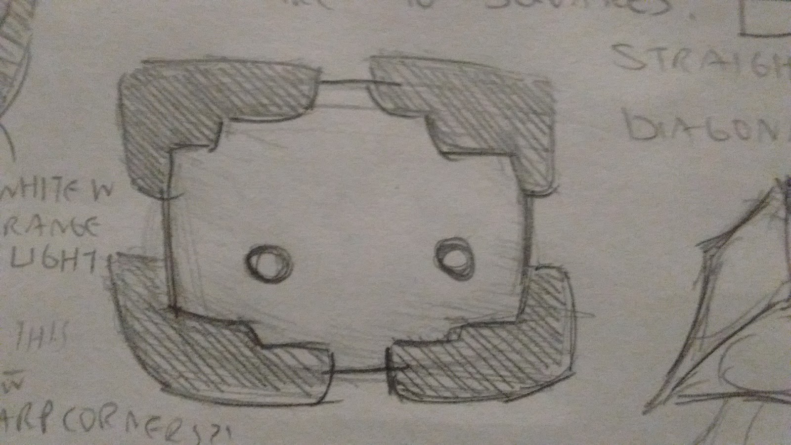
At this point, I realised that I shouldn’t have rounded edges at all, since it is completely unlike Unity to do so. When looking at their websites and any Unity related graphics, a common trend they had was using bold diagonal lines and geometric shapes with very sharp edges. Even the buttons on Unity’s website were all perfect rectangles, rather than rectangles with rounded corners.
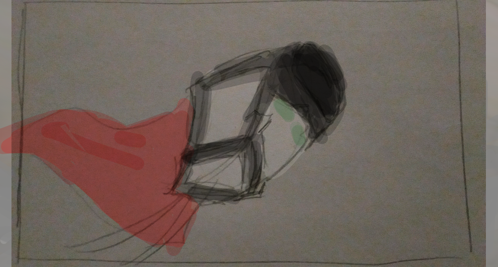
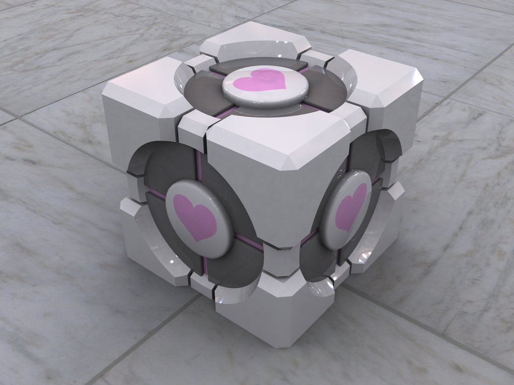
So I decided to make a version that was more cube shaped, with a circular face design inspired from the companion cube from portal (videogame). However, I found that I didn’t like the circular face on a cube, and wasn’t sure if I wanted my character to have circular eyes either.

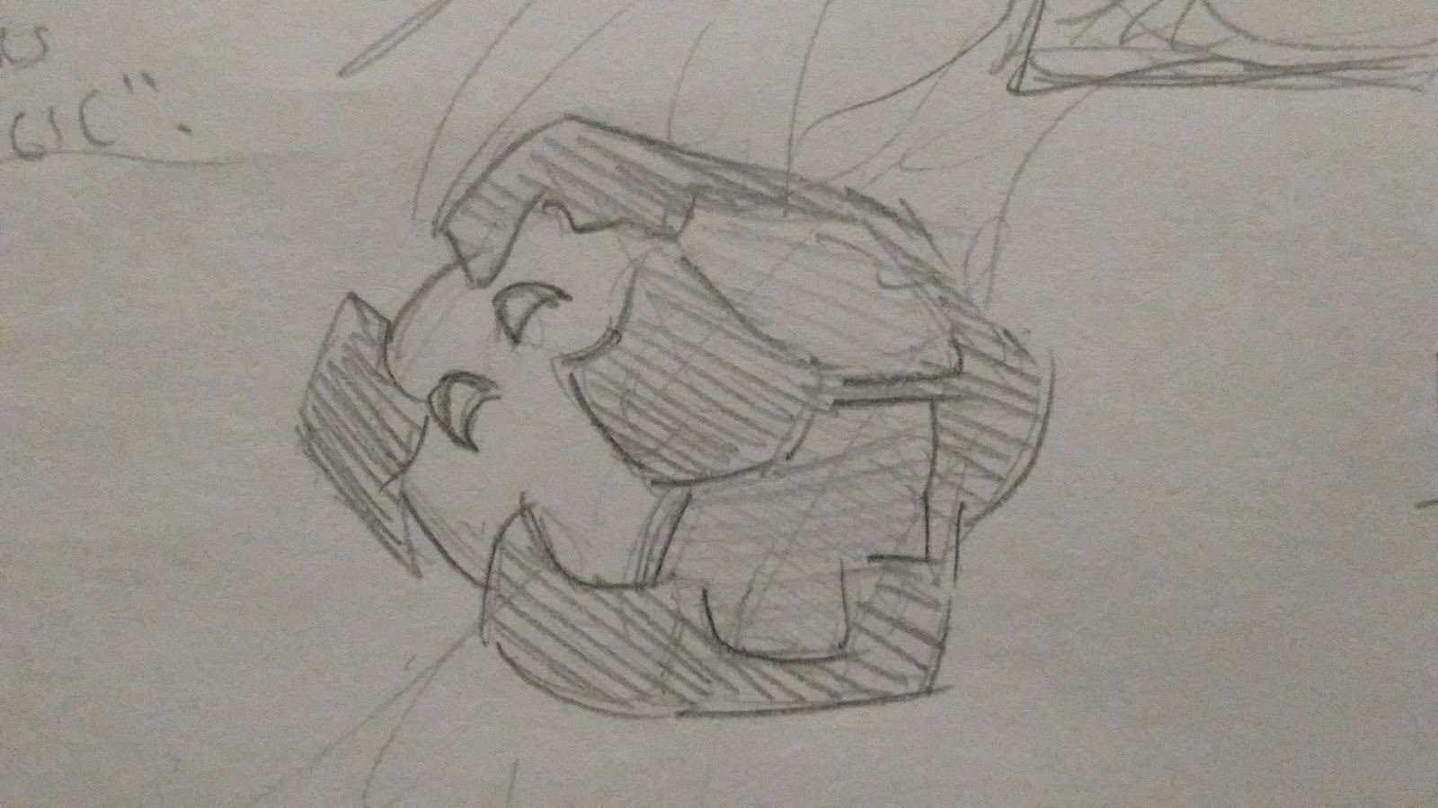
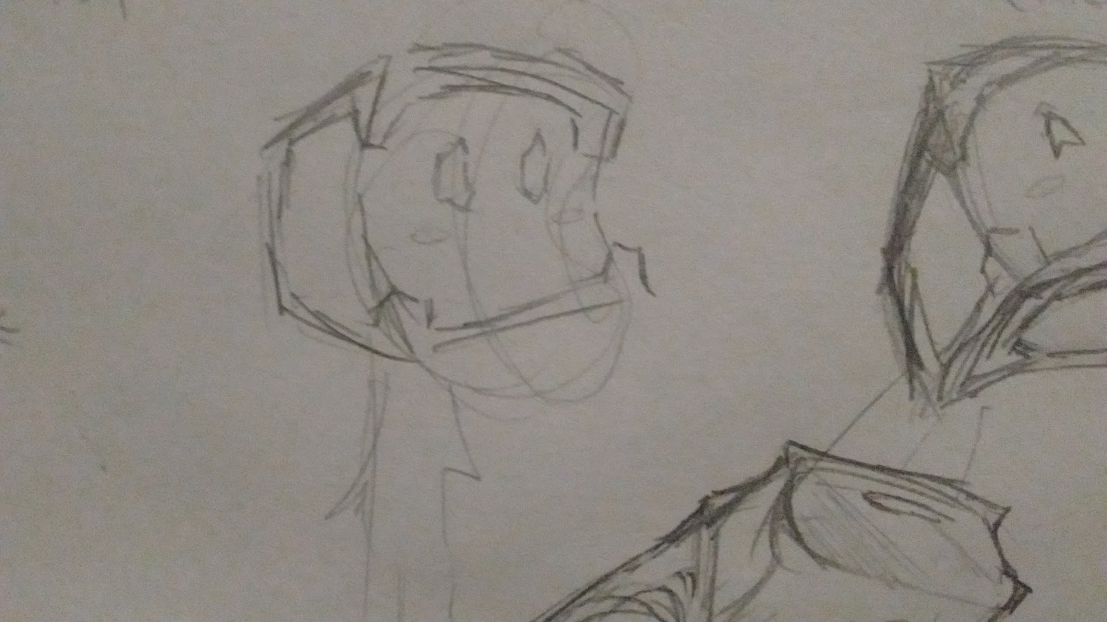
I didn’t quite like the look of it, but felt that getting rid of the soft corners completely was a step in the right direction. From there I came up with several more concepts, where I merged the past ideas of having a square mascot, and a mascot that had the black pieces sticking out of it. I also experimented with other eye shapes other than circle. At this point, I felt my mascot was starting to show promise:


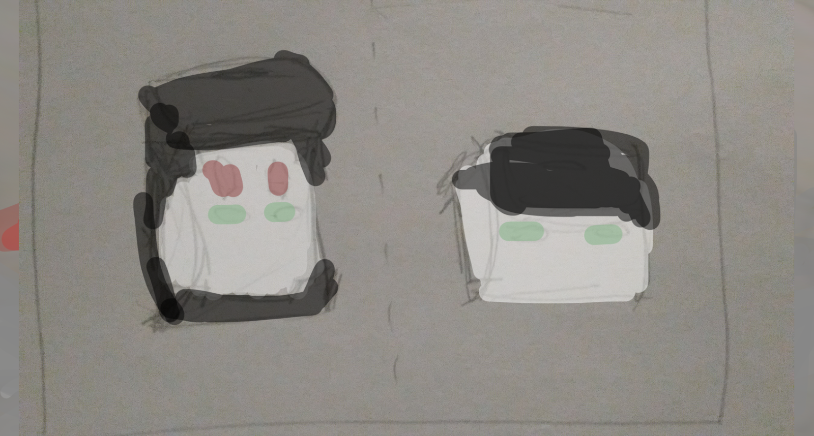
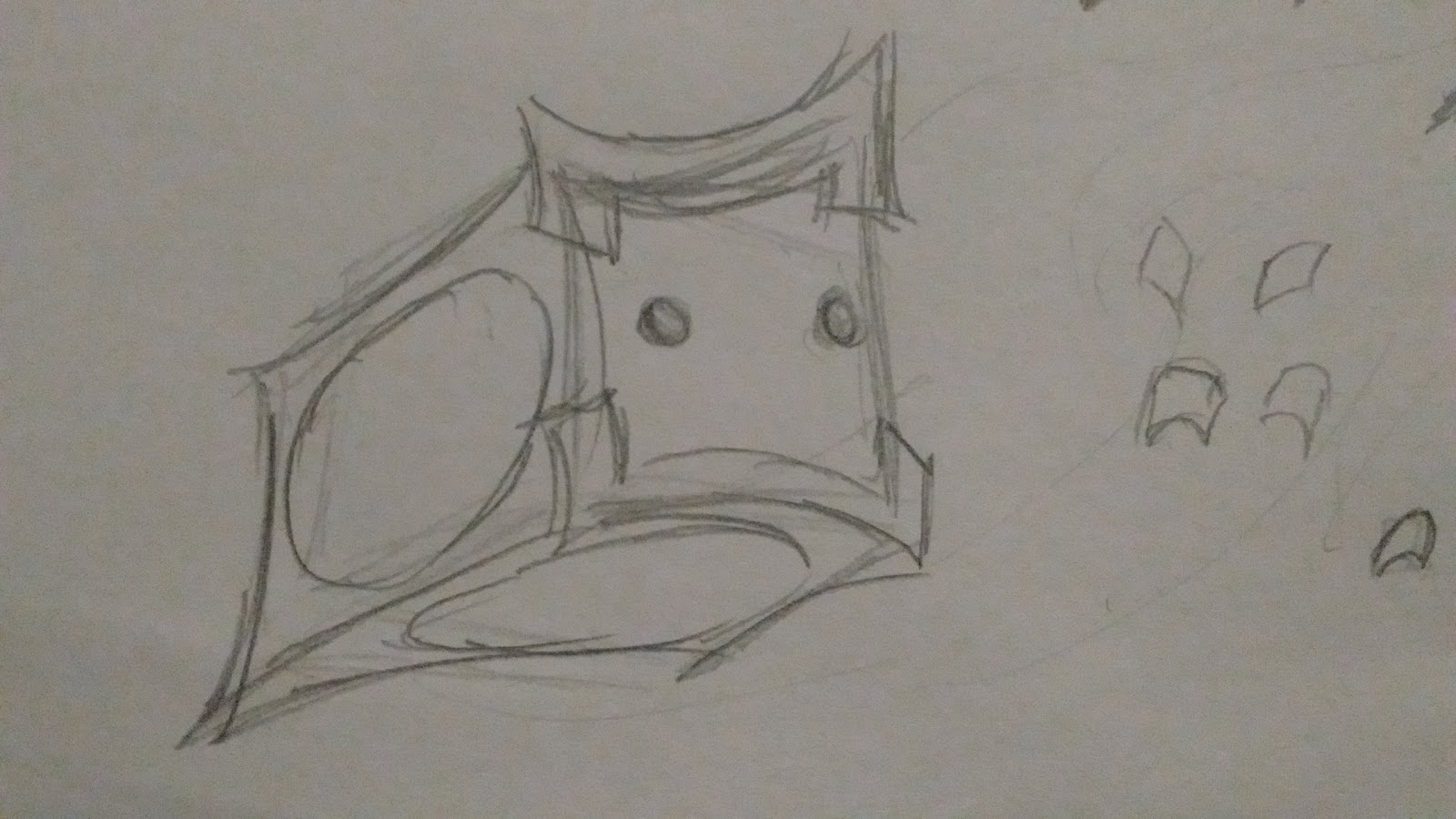
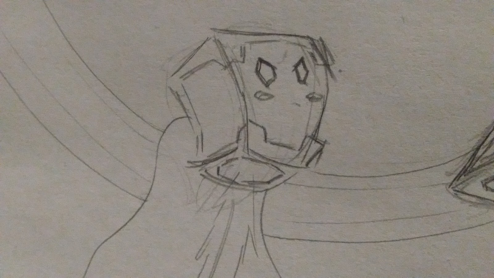
With the next design, I finally felt like I had made a break in the character! I had the idea to give my character VR goggles since Unity is currently pushing VR as one of their main selling points, and I felt like the goggles were similar to the black pieces that were already attached to my character. It also would have ‘solved’ the eye problem I was having, in being unsure of what eye shape I wanted. Although I didn’t end up having VR goggles as a permanent part of my character, I feel like I nailed how to make a cube have a dynamic pose as well as the black bits attached. This was also the point where I gave Uni a jet-like feature that it can move around with.

From there, I tried redrawing Uni in other poses It was at this point where I decided to also give it blushy cheeks, since I wanted the face to have more saturation instead of being pure white, which doesn’t always stick out that much.

Next, I brought Uni into photoshop and started playing around with colors. This was my original color scheme:
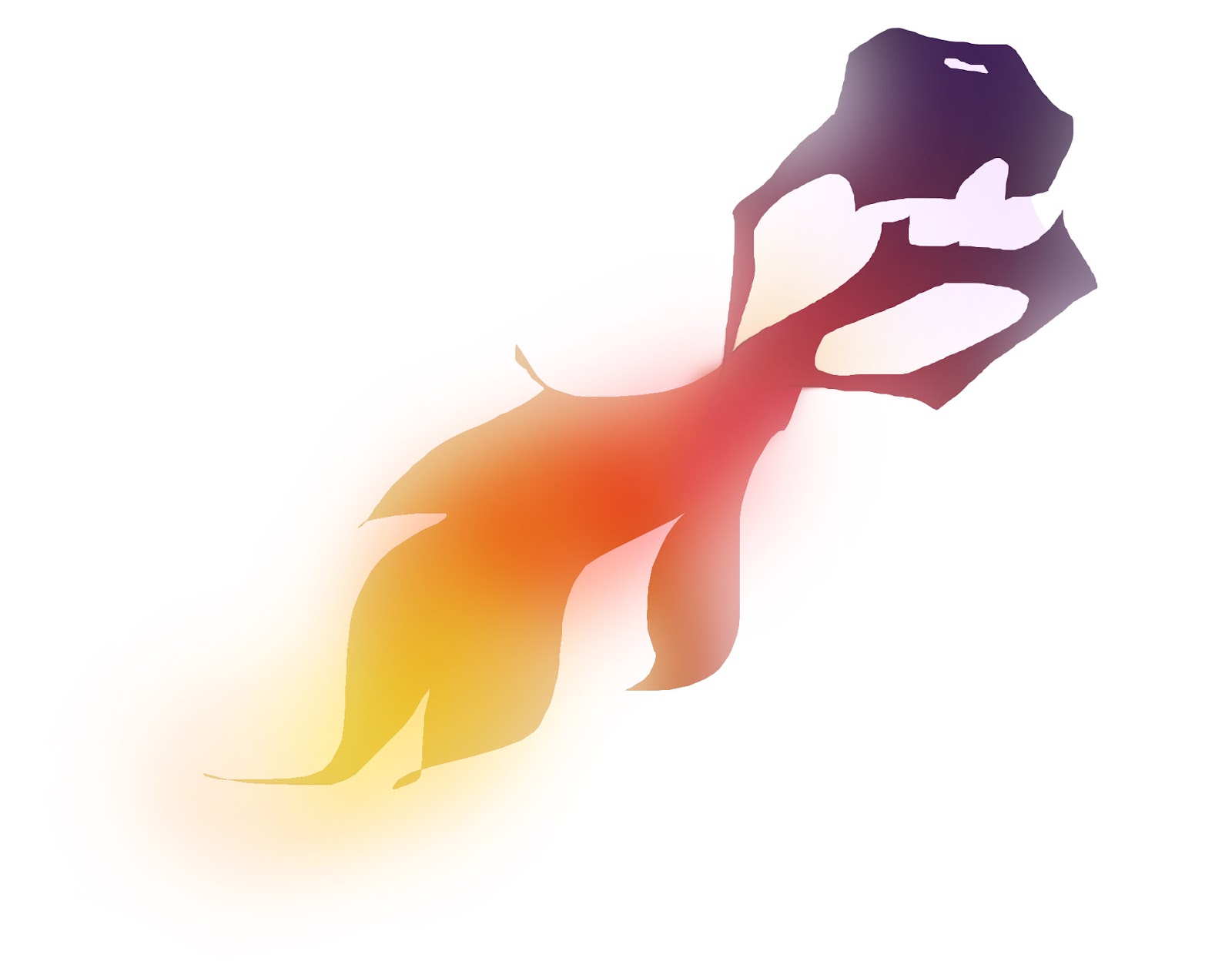

Although I like the way it looked, I also felt that it didn’t seem ‘Unity’ enough. But through playing with the color filters and adding a blue filter, I realised that I was not using the Unity colors! Which is, a lot of grey and aqua. By reexamining the Unity branding, I was also reminded of how much they like bold diagonal lines as well with their bold aqua colors. So I decided to make the flame of the jet into an aqua laser like fire instead, that I could tilt at a diagonal line. From my research, Unity is also known to use pink whenever they want to emphasis and contrast something (evident by the call to action buttons on their homepage), which contrasts well with their otherwise grey, blue, and green color scheme. This is why I decided to make the face have a pink tint to it, and pink eyes. Meanwhile the blush spots on its cheeks are slightly green to reference green as their secondary color. It wasn’t until this stage that I realised that I wanted the eyes to be polygons, which are often used in tech logos and appear techy, but are more expressive than square eyes which I had tried without much success.
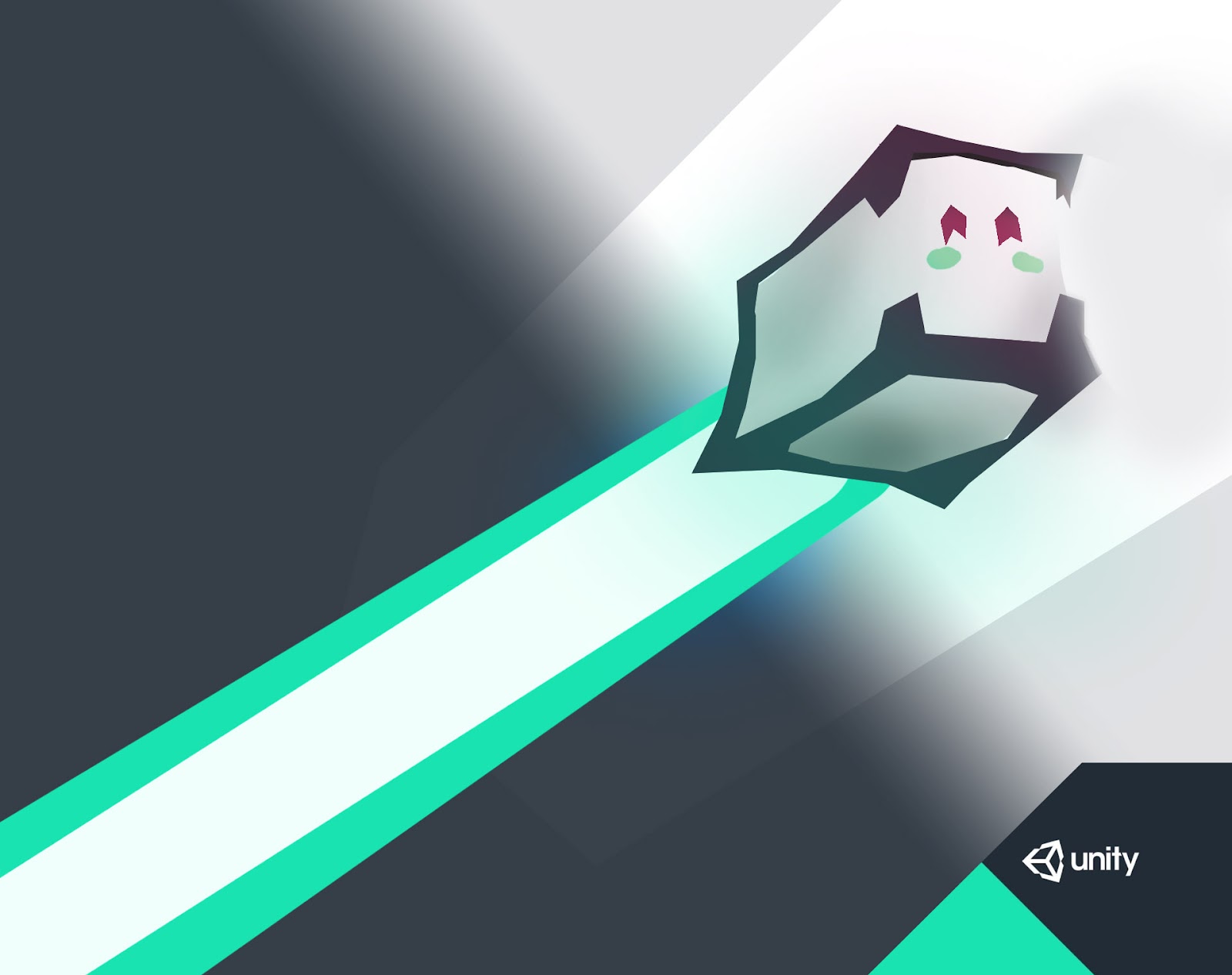
Finally, I cleaned it up when I made the ‘final version’:
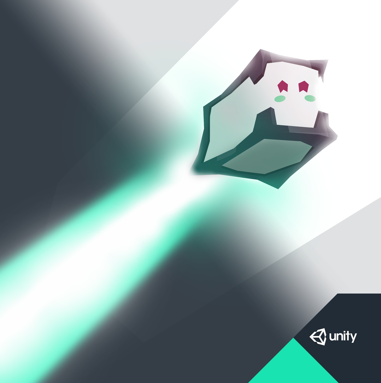
Which became part of my unity advertisement as well:

UNIQUE SELLING POINT
What Uni can offer to Unity is to have an icon with personality that people can recognise and adore, something I wanted to emulate from the android logo, which was originally made for developers only, but people loved it so much it became a logo for android in general. It has personality and appears cute and people can treat it amicably similar to the paperclip in microsoft office. Unity has quite a big community, and I believe that if they tried to make a friendly and cute mascot such as Uni the community might start treating it like a community ‘pet’.

When creating Uni, I was successfully able to imply:
Stability, logic, techy, friendly/cute==================================================================
Below is the personal research I did when first designing my mascot, Uni:
==================================================================
Creating a Unity Mascot: Research
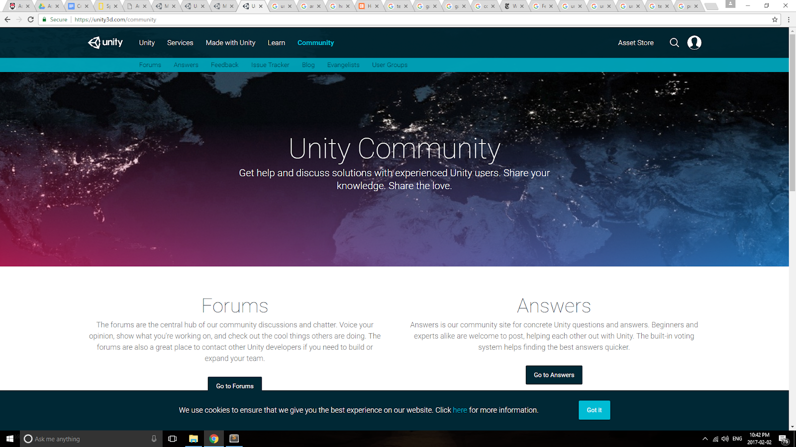
Unity often likes to solid shapes with diagonal lines, and the colors white, dark grey, and bold/bright aquas. Once in awhile you will see unity use pink to contrast with their otherwise blue-green-grey-white color scheme.

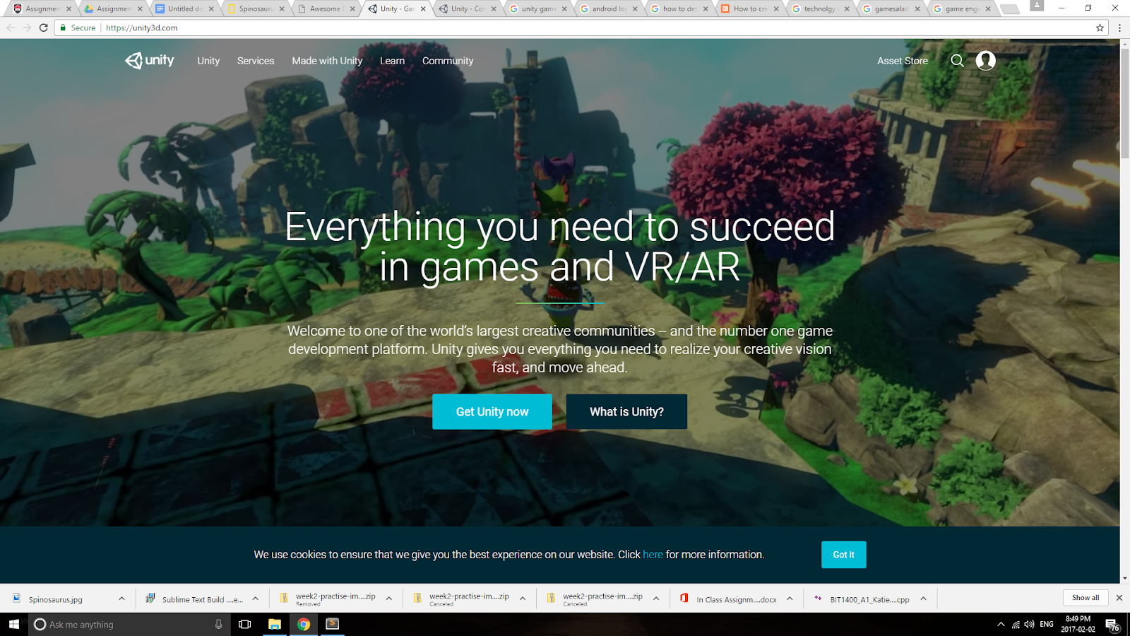
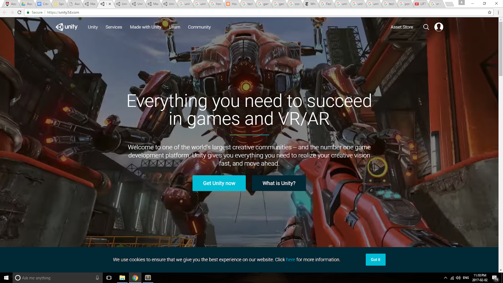
Unity website screenshot. Much aqua, blue, grey, white going on.
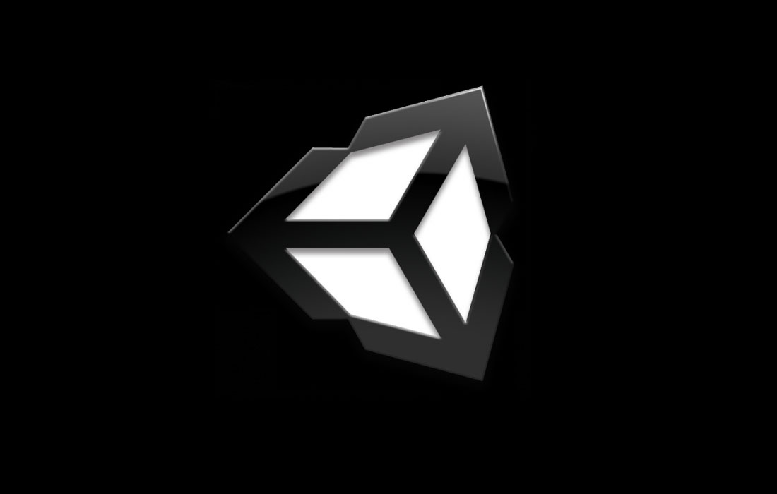
Unity logo, it looks very much like a 3D cube in this image. (Also worthwhile to note that unity often calls itself unity 3D)
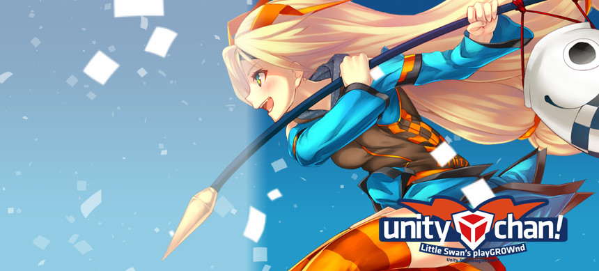
Japan’s unity chan, inspired by microsoft’s microsoft-chan. I don’t know how this helps really, this is the first time I’ve seen it and it’s very different than the unity marketed to us here in america.
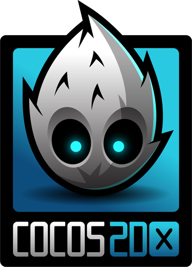
The cocos game-engine mascot. Note how although it is a white and grey mascot, they are able to use a highly saturated blue to make it stand out more. It also looks very cute because of it’s large head and high ‘forehead’ which seems higher because of it’s ‘hair’. Because of it’s metallic texture makes it also looks techy, and since it’s shaped like fire it looks very dynamic. This makes me wonder how I’m gonna make a cube look dynamic, what unity did was rotate it a bit so it’s actually made up of a lot of diagonal lines and looks like a polygon, but im gonna make my cuve in 3D space so maybe the pose will matter a lot or I’ll make it’s face on the side I geuss we’ll see.

Another game engine’s mascot. A trend I’m noticing with these techy mascots are a lack of mouths. I wonder if there is a reason for it. Perhaps it makes it look cuter when there is but an emphasis on the eyes, also cute things have generally small mouths. (NOTE! After thinking back to that Optus mascot article linked below, I have an answer for this! The mouth is simply not needed in a mascot that needs to be simple, as you can show its expression in just its eyes and body! Quote: “The counter of the 'O' became his face, and soon after the realisation that this and his eyes were all that we needed to build his expressions, his mouth disappeared.”) I’m also noticing a lott of semi-circles, especially if you go look at that android logo down there. I beleive that maybe it’s just the fact that it’s a geometric shapes look strudy/strong, logical and techy, meanwhile curves also look more user-friendly. A semi circle has both studry straight lines and curves, so i geuss it is percieved as both friendly and sturdy/logical. Especially when it is on it’s flat side as in the android mascot below, it looks quite sturdy.
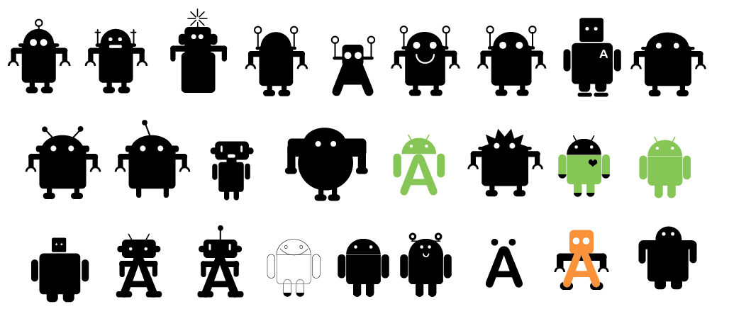
The android logo. An excellent example of a logo that look friendly, cute, and lovable, but also techy, logical, and sturdy. It has fair use of geometric shapes (sturdy, logical), ROUNDED EDGES (friendly), far set eyes (cute), and antennas for… originality? Idk but they look quirky and make it seem more friendly. The thing on the Optus’s mascot’s head in the example below has a similar effect, whatever this interesting effect is. THE QUIRKY AFFECT!

I love this site’s process on how they made the Optus mascot logo. I like how they simple started with a blob, and how many limbs it has depends on how many they need it to have. I would like mine to simple start with a square.

Unities logog can even look like 3 arrows pointing outward, very dynamic feeling. Although they are all pointing apart in different directions, it has a very sturdy center and looks rigid.
Unity likes to use shades of grey, white, and bolder blue/greens and once in awhile has bright pink for emphasis/contrast, bringing your eyes to that location. Sometimes they will use purple as well.
Above screenshot good rep of their commonly used colors, also they sometimes use purple, eg:
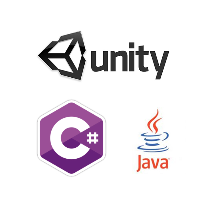
Unity’s logo is a cube but it also looks like a polygon like c# logo which is a techy logo bc a lot of techy logos have polygons and polygons are techy so are geometric shapes in general.
 Unity often has shapes with diagonal lines and bold colors, often uses this nice dark shade of grey
Gears: eyes apart for cuteness, large jaw for ‘heavy build’ strength appearance, nose for curiosity

Geometric shapes (including cubes and polygons). Gears, connected circles.


I like the head, similar to what i want to do.
Also like the use of color in an otherwise black and white model that wouldn’t stick out much. Note how the color red is quite (almost maximum) saturated to help it stick out!
A great example of a square cute character:

I like how this square character retains it’s sharp edges while still being elastic and friendly looking. I think my character should keep it’s sharp edges as well despite how in the other mascots haveing rounded corners made them look more friendly, seeing how many ‘sharp’ lines and cutting diagonals unity has. They don't have any curved lines! Even their buttons are very sharp rectangles! Despite keeping my corners sharp however, I can still curve the edges of the square for personality, moement, and to give it a friendlt look. To watch the rest of the video and see the great movement of the square, check out this video: https://www.youtube.com/watch?v=3WRQJyRFriI
Another note from this character: Possibly try square eyes in my own character!
This also reminded me of the companion cube from Portal!
I like how they have a circle in the center. I could incorporate a circle like shape in the center and a round face similar to the the optus mascot. (just an idea)
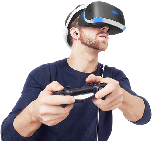
When drawing out possible sketeches of the cube mascot, I realised that the top black thing around the cube kind of look like VR headsets! This is awesome because unity is having a HUGE emphasis on vr development right now, even having it as a main selling point on their homepage!
Let’s look at some VR headsets, shall we?
Love the sleekness on this one: Also like the headband part.
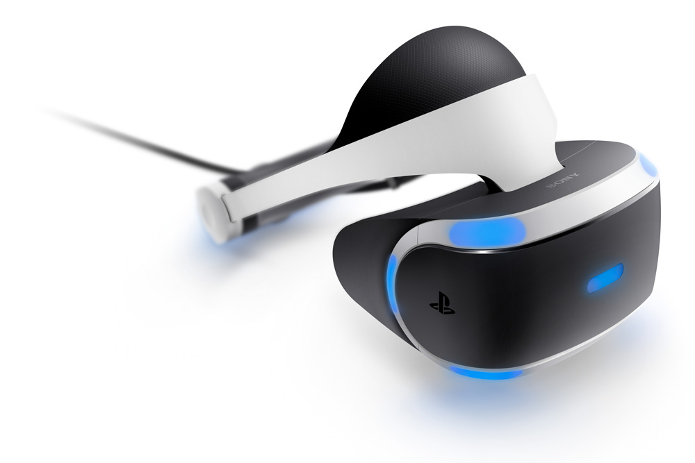
Like the cube-y-ness on this one. It matches the cube-y-ness I want to have in my own character.

This one cube-ey as well:
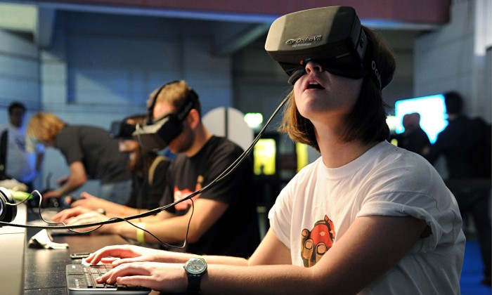
Note how the vr goggles are usually looked at from underneath. Idk why i geuss it looks cooler?
The shape of the VR goggle around the nose is similar to the notches I have in my char design already. Even cooler!